
Back again for another round of color inspiration.
Back again for another round of color inspiration. In my last blog post, “10 Branding Color Palettes For Your Website and Brand Design,” we did a deep dive into how important color is in building a strong brand identity. Well, I couldn’t leave it at just 10 palettes. Working as a Dallas branding photographer, I’ve gotten to see how impactful content starts with a strong branding color palette. So, I’ve put together 11 more palettes to inspire you. Each of these palettes is a great element to use to shape your brand’s visual identity and personality. As we all know, color isn’t just color – it’s a theme, a message, a feeling. If you would like a more in-depth on the role color plays in brand identity, check out my last blog post.
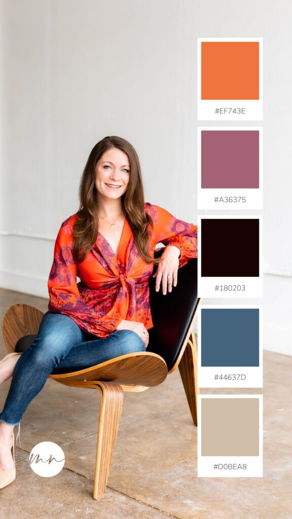
1. “Coral Blues” – Coral Orange, Denim Blue and Mauve Purple Color Palette
Coral orange, denim blue, and mauve purple in a brand color palette create a unique and captivating blend that speaks volumes about creativity, sophistication, and a touch of whimsy. Coral orange conveys vibrancy and energy, denim blue brings in a sense of reliability and modernity, while mauve purple adds a dash of elegance and individuality. Together, these colors create a palette that’s both contemporary and chic, making it an excellent choice for personal brands looking for a blend of style and substance. This palette is perfect for lifestyle influencers who to build a distinct and refined identity. It’s a fusion that appeals to those who want to convey a sense of artistic flair, authenticity, and a touch of refined luxury within their personal brand.
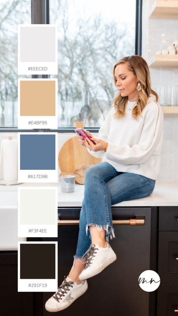
2. “Modern Winter” – White, Steel Blue and Tan Color Palette
White, steel blue, and tan in a brand color palette evoke a sense of minimalistic sophistication, reliability, and warmth. White signifies simplicity and a clean aesthetic, while steel blue adds a touch of professionalism and tranquility. Tan complements these hues with its earthy warmth and approachability. Together, they create a palette that’s elegant yet inviting, making it an ideal choice for personal brands who appreciate elegance and professionalism. This color palette is well-suited for home and interior designers who would like a balance between a polished, professional image and a welcoming, approachable demeanor. For brands aiming to communicate reliability, sophistication, and a sense of warmth within their visual identity, this is one of the best color palettes.
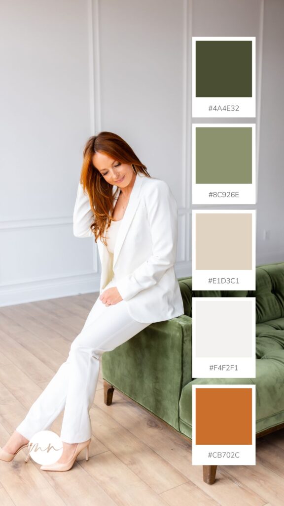
3. “Forest Sunset” Forest Greens with a Pop of Orange
Forest greens paired with a pop of orange in a brand color palette create a dynamic and nature-inspired combination that communicates balance, vitality, and a touch of warmth. The deep, rich tones of forest green communicate a connection to nature, and portray a sense of stability and growth, while the muted orange adds a touch of warmth and creativity without overwhelming the palette. This palette is down-to-earth and lively, making it the perfect choice for personal brands that want to be associated with home and lifestyle bloggers, or organic nutritionists. This color palette allows them to mix nature and an appreciation for life within their personal brand identity.
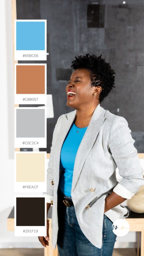
4. “Contemporary Business” – Cyan Blue and Shades of Brown Color Palette
Cyan blues paired with rich shades of brown in a brand color palette communicate a fusion of modernity, strength, and grounded sophistication. The vibrant cyan blues exudes energy, confidence, and a contemporary edge, while the deep shades of brown bring a sense of grounding and authenticity to the palette. These colors create a compelling contrast, striking a balance between boldness and approachability. For personal brands that want to make a strong visual statement while maintaining an approachable appeal. Entrepreneurs will love this palette as it communicates a sense of reliability and a touch of natural charm. The cyan blues add a refreshing pop, drawing attention, while the shades of brown provide a solid foundation, making this combo versatile for those who want to stand out with confidence in a variety of professional and creative contexts.
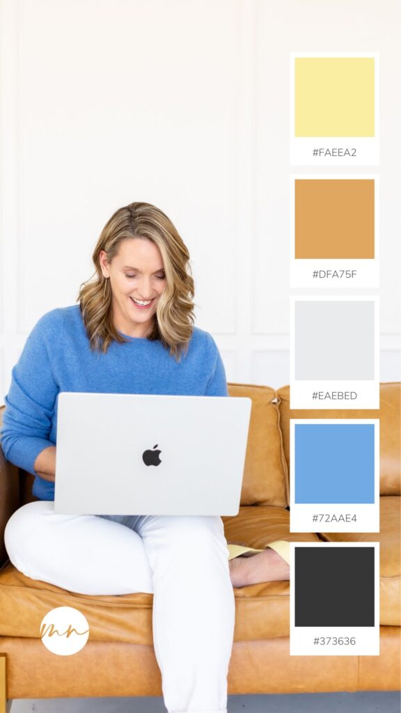
5. “Copper Comfort” Copper Brown, Cozy Blue and Yellow Color Palette
Copper brown, cozy blue and yellow in a brand color palette create a soothing and inviting atmosphere, communicating a blend of warmth, grounded elegance, and comfort. The faded yellow brings a subtle brightness and optimism, while copper brown adds a touch of sophistication and earthiness. Cozy blue introduces a sense of calm and comfort. These colors pair well for personal brands that to want to convey a sense of relaxation and approachable refinement. Lifestyle bloggers will love this palette. It offers a comforting and visually appealing identity, making it versatile for individuals or businesses that want to create a brand image that feels both comforting and welcoming.
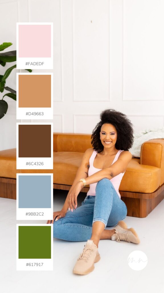
6. “Tranquil Garden” – Pink, Brown and Green Color Palette
Light pink, shades of brown, and green in a brand color palette create a sense of charm, warmth and sophistication. The light pink introduces themes of softness, grace, and femininity, while the shades of brown add an earthy depth and reliability. Green brings in a refreshing vitality and a breath of nature. These colors create a palette reminiscent of a serene garden, making it the right choice for personal brands that want to convey a blend of serenity and natural beauty. Personal brands that value celebrating and welcoming people as they are will gravitate to this palette. The light pink infuses a gentle allure, while the shades of brown ground the palette, and the leaf green adds a revitalizing touch, making it versatile for individuals or businesses seeking a brand image that is “human”, sophisticated and has a connection to the natural world.
7. “Timeless Sophistication” – Black, Grey and Navy Blue Color Palette
Black, grey, and navy blue in a brand color palette create a sleek and elegant aesthetic, communicating a sense of authority. The deep, solid tones of black and navy blue convey strength and professionalism, while the neutral grey adds a touch of balance and adaptability. Together, these colors form a classic and versatile combination that pairs well, making it suitable for personal brands aiming for a refined image. This palette is ideal for professionals, or individuals in industries where a polished and authoritative presence is crucial. It offers a clean and powerful identity, making it adaptable to various situations while maintaining an aura of timeless elegance.
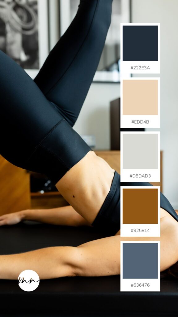
8. “Eternal Elegance” – Midnight Blue and White Color Palette
Midnight blue paired with white in a brand color palette communicates a sense of being elegant and poise. The deep richness of midnight blue exudes a refinement, while white brings simplicity, and a clean aesthetic. Together, these colors form a striking yet balanced contrast that conveys a timeless and professional aura. This palette is best for personal brands looking for a sleek and polished image, such as luxury brands or fashion designers, or professionals in finance.
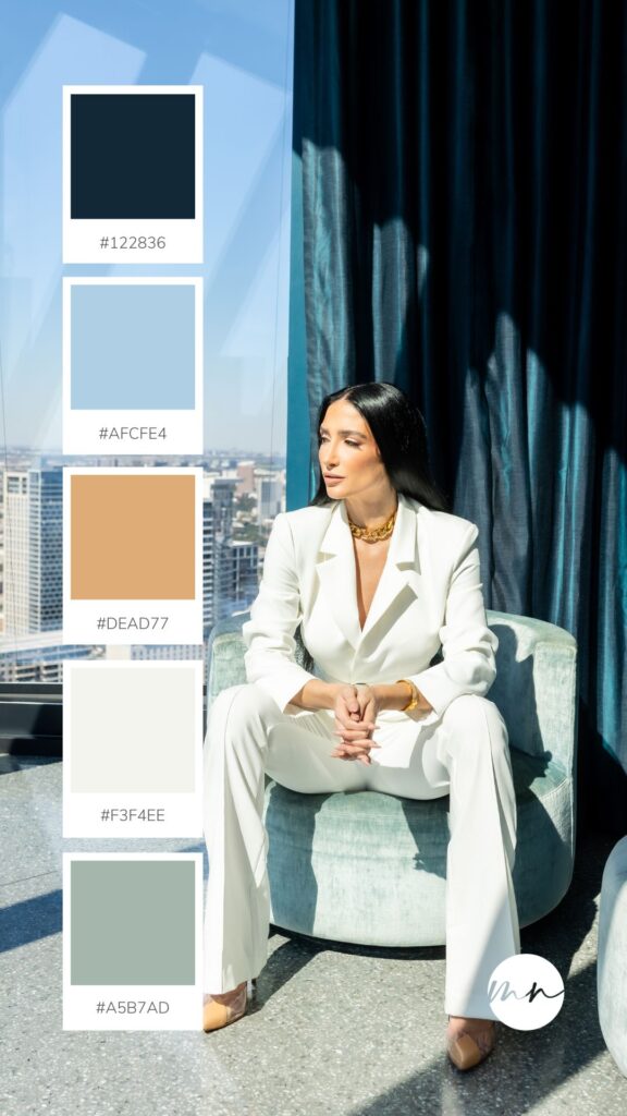
9. “Blue Horizons” – Neutral Tones with a Touch of Blue Color Palette
Neutral tones with a touch of blue in a brand color palette communicate a versatile, calming, and modern brand identity. The neutral tones, such as greys and soft browns, provide a subtle backdrop, creating a sense of balance and adaptability. The addition of blue introduces a touch of serenity, trust, and depth to the palette. Together, these colors create an agreeable and friendly identity. Travel bloggers and wellness coaches could really benefit from using this palette for their brand. It gives gives a neutral foundation with a pop blue, making it work for various brands while keeping a calming and cohesive aesthetic.
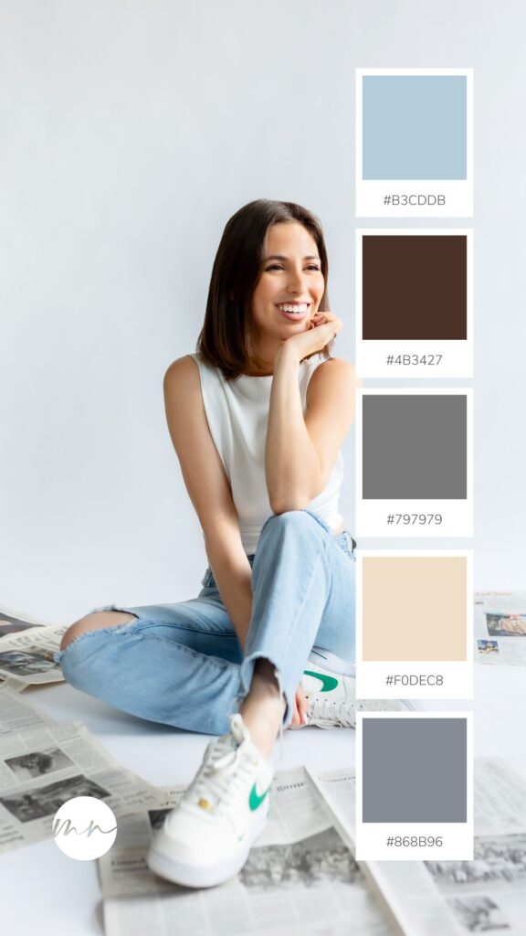
10. “Organic Oasis” – Brown, Grey and Green Color Palette
Brown, green, and grey in a brand color palette blend together vitality and modernity. Brown brings in stability and earthiness, while green symbolizes freshness and revitalization. Grey adds a calming and contemporary element, grounding the palette with a tranquility. These colors come together to form a balanced and refreshing combination, ideal for personal brands aiming for a sense of organic authenticity. This palette is perfect for wellness coaches or influencers. It communicates a refined yet down-to-earth image, inviting audiences to embrace a lifestyle of balance, growth, and modernity.
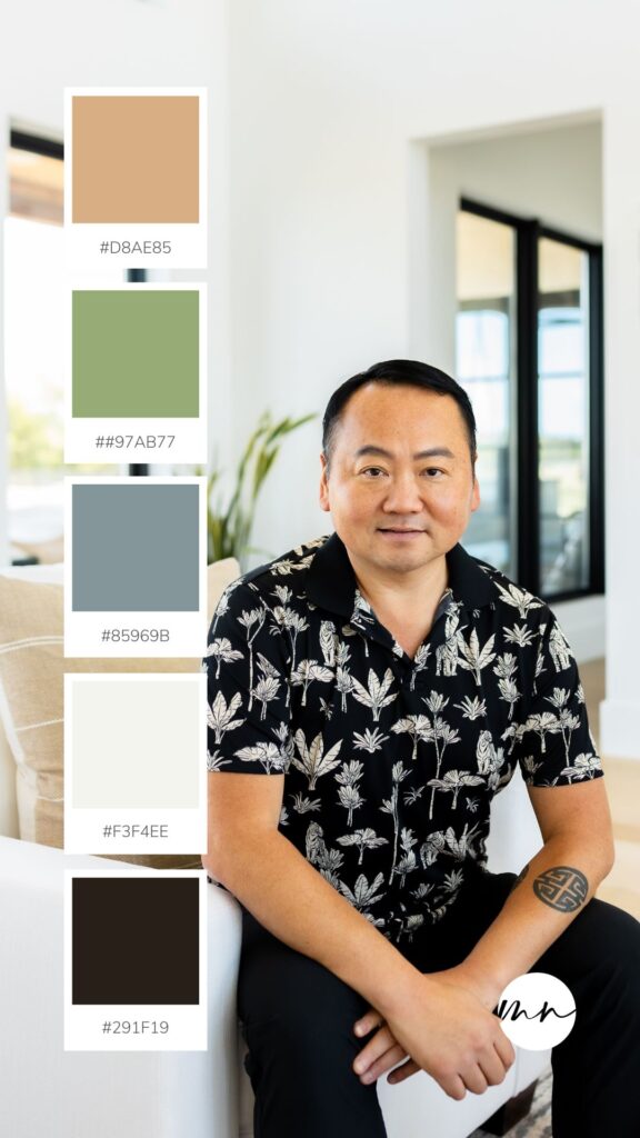
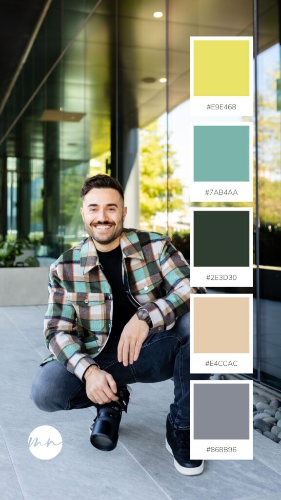
11. “Organic Oasis” – Shades of Green with a Hint of Grey
Playful and adventurous shades of green in a brand color palette convey a vibrant and lively identity, creating a sense of energy, exploration, and creativity. These shades infuse a playful spirit into the brand, conveying a dynamic and forward-thinking approach. This palette is right for personal brands who to project a sense of youthfulness and a willingness to embrace new ideas. It’s ideal for creatives, lifestyle influencers, or brands in the tech and entertainment industries, offering a visually exciting identity that captivates audiences and sparks a sense of curiosity and adventure.
Colors are never just colors. They communicate thoughts, feelings, and messages, so it is important to choose colors that you feel accurately represents the messages that you and your brand value. If you want to get to know even more about color palettes and how to build them for your brand, feel free to reach out at info@moniknormandphoto.com.